Where
KEA - Brand Design
For
Wonderful Copenhagen (School Project)
What
Magazine Concept
Role
Graphic Cesign, Concept Development
Copenhagenism
Wonderful Copenhagen wanted the city presented in a way the guidebooks were not managing. We went after the people the guidebooks were not reaching. Visitors who avoid the tourist flow on purpose and want the version of a city its residents actually use. They are called invisible green tourists.
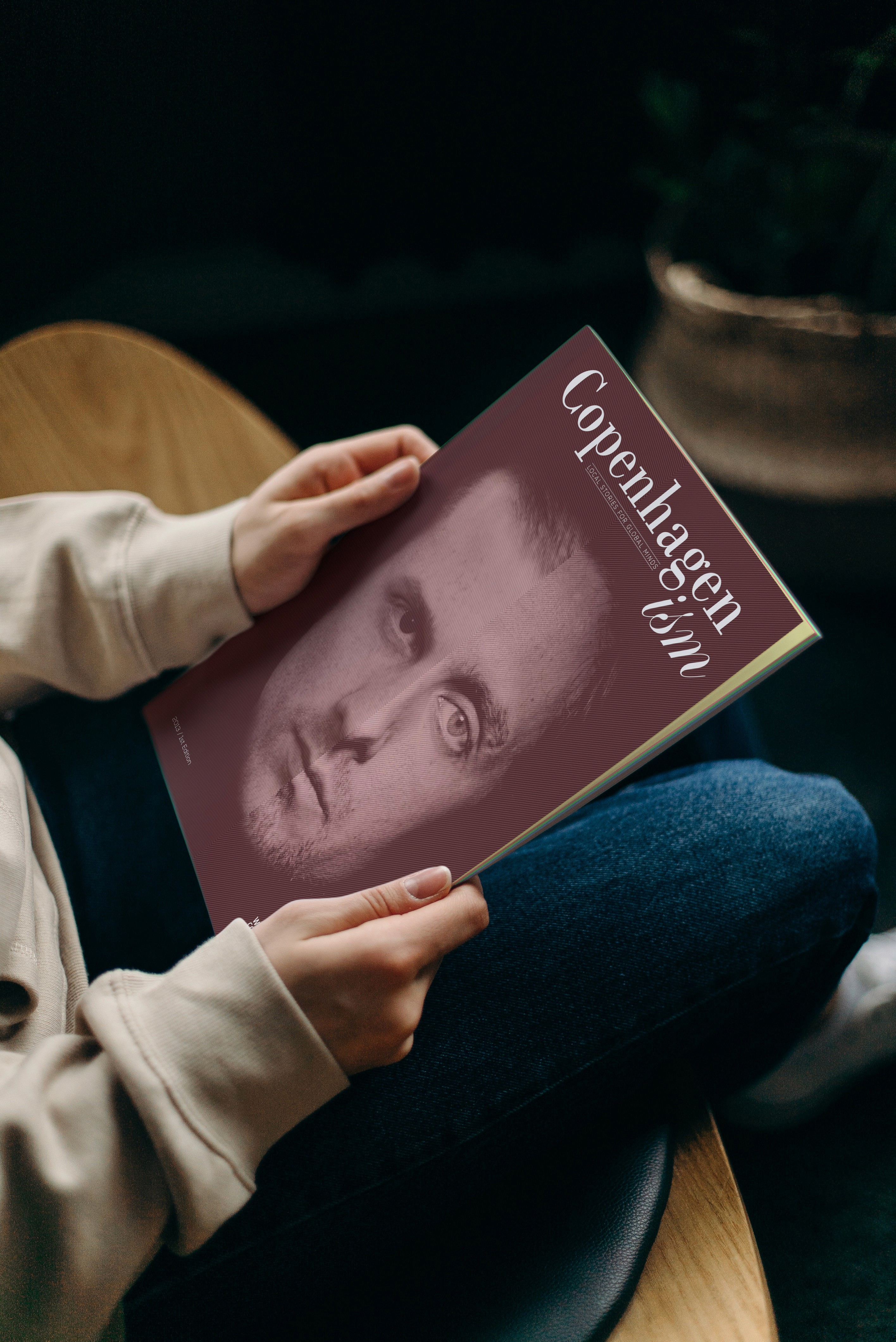
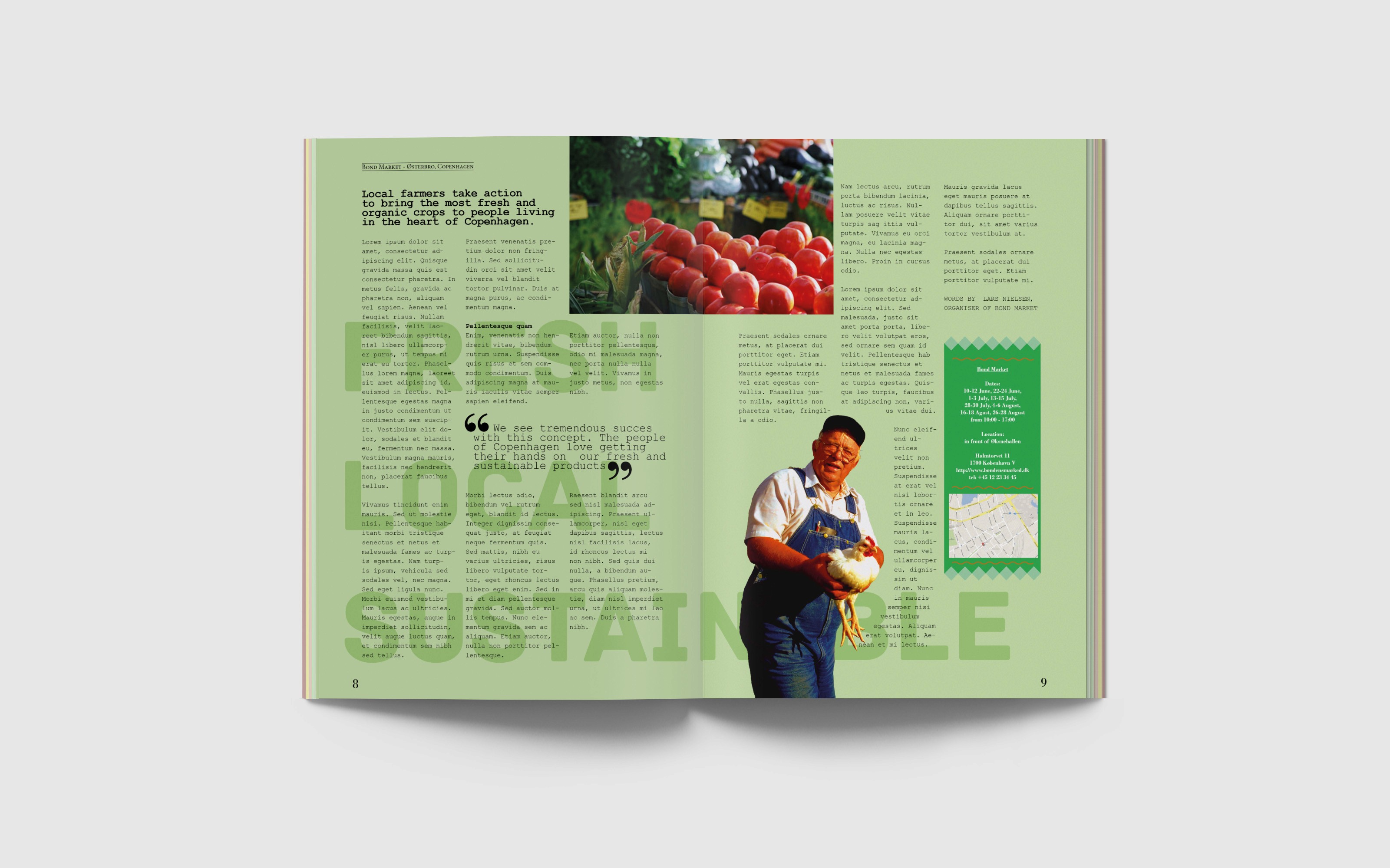
We made them a magazine about local culture and Copenhagen's sustainable side. Local people, local events, restaurants that only use local ingredients, hidden flea markets. It is called Copenhagenism.
The cover comes from the main story of the issue, about two people who meet in Copenhagen and find out they have the same vision for a restaurant, which they end up opening together. I made the cover from their two faces melted into one.
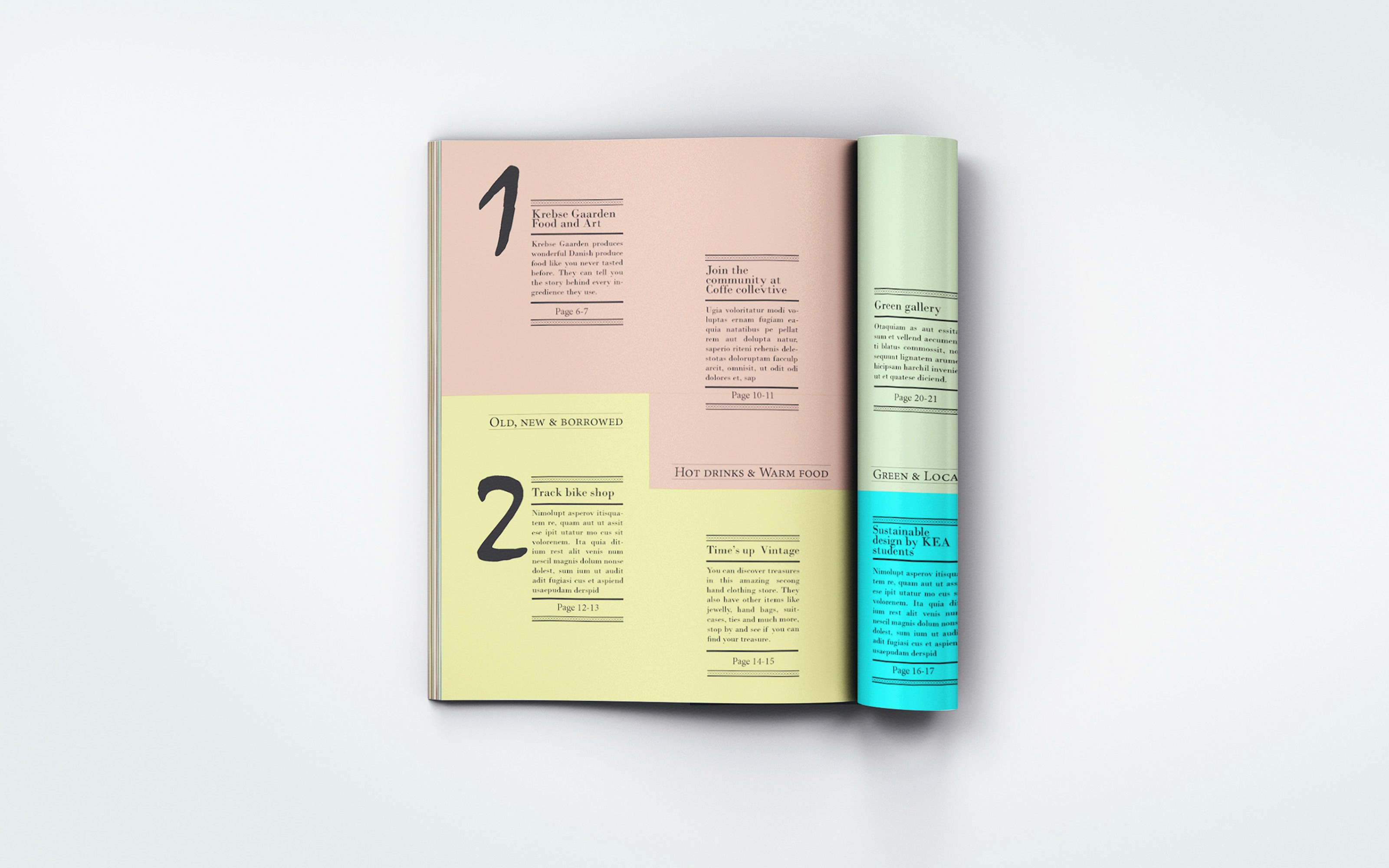
Every article has its own pastel background colour. The colours are visible along the page edges when the magazine is closed, so you can find your way to an article without opening it first. They are also a way of showing the different sides of Copenhagen, one colour for each side of the city we wrote about.



OTHER WORK


